Posts

Showing posts from September, 2016

Species of Spaces

Image
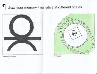
In relation to our studio work on A Sense of Place, in our first studio session we were required to create a series of memories that would challenge the sub-title of "species of spaces". These should demonstrate how spaces work, how they are effected by inhabitants and should explore some form of narrative.  The drawings created in the boxes provided should be simple yet effective demonstrating our thoughts and ideas. The task was also to consider the frame, how the frame can be effective, scale, proportion, and the use of these in story telling. We were also required to consider the potential use of symbolic and visual messages such as feelings, objects that should all have some form of contextual background. I think this task and this objective was perfect for the first studio session as the idea and methodology of being a designer embodies all those things. Having a consistent viewpoint as well as mapping out initial thoughts and ideas I...

Process and Production: Manfiesto Poster

Image
In our first Process and Production workshop we looked at typography posters and our skills and knowledge of Adobe In Design. Previously I had never used In Design and I believe I picked up the basic skills very quickly and accurately. The task was to recreate a poster using grids, shapes and text that should look as close to the original as possible.  Here are the results:  It was our task then to recreate our own typography using shape, layout and type as a main theme that ran throughout it. The poster had to be a2 Portrait with bleed that was a typographic expression of our own personal creative manifesto. The colour and word choices within their poster needed to have meaning and context.  I started by using my name as a base idea; I knew I wanted this to fully take over the page that had elements of a backdrop or another word within it. I then chose the background colour - black - as I wanted a monochrome...

A Sense of Place: Introduction to the Brief

Image
In the first Studio Session we were all introduced the first brief: A Sense of Place. When I first got handed this theme a million ideas came to mind that I could create as a concept idea. I initially first thought out how 'place' can define culture such as Fashion, Food or Pop Culture. Another quick idea that sprung to mind was how photography mixed with graphic design can advertise certain places and how a sense of place can be imagined in this view through advertising etc.  The brief is broken up into two different phases and phase one is all about devising an extensive body of research both primary and secondary.  We came up with many different routes of influence to initially look at as part of broad research.  Graphic Designers Richard McGuire Olafer Eliasson  Paul Rand Mariscal  Harry Beck (London Underground) Artists Keith Haring  Damien Hirst Tracey Emin Film  Alfred Hitchcock...

Future Geneologies

Image
A genealogy is similar to that of a family tree; a representation of how different ideas can form from one another and create multiple different possibilities. This is a creative perspective in the sense that everyone has a different idea or thought and there is no right or wrong answer.  Our task was to take one genealogy idea and create multiple outcomes or scenarios that could happen. As a group we took the idea that tinted sunglasses eventually become fashionable and everyone would wear them. A few scenarios we came up with was that the Queen would eventually wear them, you would be able to take photos on them, change colour depending on trends and culture, access social media on them similar to the apple watch and that people would become lazy and talking to each other would eventually die out and not exist anymore.  The underlying tone of the seminar was that this is how ideas and thoughts are evolved....

First Things First Manifesto (2000) - What does design mean to me?

Image
In our first lecture of the year we was introduced to the First Things First Manifesto (2000). The version, as seen, is the updated version of  of the earlier  First Things First  manifesto written and published in 1964 by  Ken Garland , a British designer. The manifesto was signed by 33 designers and published in  many other magazines and books around the world. The idea of it was to create a talking point  around artist integrity and value as well as discussing  values in design and those who believe Graphic Communication and Design should be value-free. My task was to re-open the manifesto and look at it as a young and  upcoming designer similar to those who signed the document back in 2000. I was also to think of my own ideas and influences and my own design beliefs and thoughts.   Work from the seminar on  First Things First 2000 Manifesto .  I first of all started by deducting parts of the manifesto I ...

Test Post

Yeezy Boost 750 - H5 from H5 on Vimeo .