Posts

Showing posts with the label Process and Production

Final Persona Website

Image
I have now fully completed my Persona website with published information on three projects ready for my presentation. I have kept the layout simple and all on one page even though I have struggled with making the type fit effectively and in position with the photo. In Persona there isn't an option to square of text and input photos therefore having to create a new grid box with a fitted type was tricky for me. I like the simple design and editorial feel about my layout and I think the theme helps promote the work I have created which is the main objective. Here is the Persona website I have created:  https://joemitchellprocessandproduction.persona.co

Persona Website

Image
Today we were introduced to a new way of professionally publishing design work. Persona is a site many use to professionally publish work as it has may carefully designed systems that make work look professional with a simple yet aestetically pleasing interface. I was fascinated with the website at first as I thought all the layouts and themes were amazingly put-together, combing carefully design fonts with simple and elegant layouts. I got a chance to quickly experiment with the layout and interface - my first ideas and thoughts where to present it in occurrence with the ever trending botanical theme that also relates to some fashion marketing editorials and campaigns that are simple and clean. I will complete a more finished layout with design work and annotation on there to support my Process and Production Module. 

Final Type Workshop

Image
In this final Type Process and Production workshop I created a final version of the development I have been producing over the past few weeks.  In the first type workshop I took particular interest in Wolfang Weingart's "The Swiss Poster" by which I was very inspired by the colouring, line, and shape used in the piece. The edgy and crafted lines and sharp edges helped me to produce 3 very different but interesting type versions also taking inspiration from the Helvetica font that is actually used on the poster. Then, in the second type workshop I got the chance to develop this idea further, creating 4 rough alphabet typefaces that led me to a type I was happy with. The type looked very similar to the gothic type that is already heavily used, just with more curves, lines and shapes relating back to Weingart's graphical composition.  In this final workshop I then drafted out a more fin...

Year One After Effects Finale

Image
Today was the Final After Effects workshop by which we were required to create an artwork of an object or creature that lives in the sky. The final outcome would be a collaborative film project that would be a combination of all my groups' work. We were allowed to  use sound effects, vector and photoshop artwork, and any techniques  that are appropriate to bring my animation  to life. I started by looking at the type of art I wanted to create. After looking at work by Hungry Sandwich Club and Hey Studio, It was important to me to create a fun, playful and imaginative artwork in order to animate it to fit the chosen theme of a creature or object in the sky. Both design studios share the ethos of creating eye-catching work that can stand alone as illustration or be part of a brand identity.  Being inspired by  Hungry Sandwich Club and Hey Studio , I chose to use Illustrator as a main design software. ...

Cinema 4D: Introduction to the basics

Image
In todays society motion and static graphics created on Cinema4D, are seen everywhere; from advertisements, commercials, and billboard design. The creative and implicit nature of the design creates a meaningful but very effective process of using this unique piece of software.   Today in one of the last Process and Production workshop we were given the opportunity to play around with Cinema 4D. The software was something I haven't played around with before and it was all very new to me. We were introduced to the interface and the basic elements of it.  We were also introduced to the rendering effects of the software- simple rendering and rendering for saving. The refined and simplistic nature of the design shows that the refinement can be very unique and effective.  The software, that is free for students and fairly simplistic to use, was presented to us in different stages. We started by...

Adobe Illustrator CC (Morpholo Tile Task)

Image
As an introduction to the Adobe Illustrator CC, this process and production session focused upon basic pen tool skills in relation to drawing/rendering and the manipulation of typographic letter forms.  We started off the session by learning information about Morpholo tiles and the design and context that surround them. We then learnt how to generate a random pattern making system - the idea is that we create 6 tiles that would work as a game that can be placed together and fit to make one similar to that of a jigsaw and a game of dominos.  Then, researching into a specific type using font book and online resources, we were encouraged to work as abstract as possible when using elements from a specific type. I chose to look at an Arabic Style of font as at the minute I am very fascinated with the aesthetic and look of an Arabian Style. I love the smooth lines and form and the way in which they link and bond in style...

Kinetic Typography 2: Z-Space

Image
In this workshop we learned  about 3D space - exploring depth and the z-axis in after effects.  C himamanda Ngozi Adichie's Speech used in Beyonce's World tour Prior to the workshop we were asked to prepare a text, quote, or song lyric to work with which we would then move, rotate and manipulate with Z-Space using After Effects. I chose to use C himamanda Ngozi Adichie's motivational speech about feminism - it has been a hit globally, with thousands of hits on Youtube and even an appearance on Beyonce's 2013 Album. The speech talks about women rights and the role of women in todays society so I believe it is a strong and powerful message to use within my work.  I inputted each word by word and decided to move past the recommended 10 second video so that the audience can really get a full grasp of the quote and the full nature of my intention which was to manipulate the words to what...

Second Type Workshop

Image
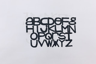
Working on designs created in the last Process and Production Type workshop, I have now developed 4 more types inspired by the shapes, lines and typefaces used in Wolgang Weinhart's iconic piece of design.   The piece is renowned for using sharp lines and a simple swiss Helvetica Font. I have recreated this in a development over 4 quick typefaces.  Starting off with a basic grid and a black pro-marker, these typefaces are a refinement of each other developing ideas of line and composition. The first takes Weinhart's contemporary Helvetica Font with a twist. Using long lines and wide edges, the mix of Upper and Lower Case letttering adds for a unique effect that I really like.  The second is a development from the first, using thiner letters with more negative space. The lettering seems very naive, almost as if it should belong on a children's book for example. Although very contemporary, th...

Helvetica Deconstruction Publication

Image
In this Process and Production workshop we learnt more about Helvetica, the typeface's qualities and editing it in a way by which it looks contemporary and unique.  In previous Theory as Practice Lectures and Seminars we looked at the use of Helvetica, the way in which the simplicity and utility makes it work readily in contemporary design and how breaking it down and reversing the meaning is a very ironic way of using the famous typeface. This was same in this workshop - the degrading of the simplicity and effortlessness makes it a very interesting project to me.  Our task was to create a full colour publication on InDesign by which would either be a page layout or a cover layout. We were given the specific measurements that included the spine and asked to consider professional outcomes such as bleed, slug and layout that would make for an interesting composition.  My first thought was how I ...