Second Type Workshop


Working on designs created in the last Process and Production Type workshop, I have now developed 4 more types inspired by the shapes, lines and typefaces used in Wolgang Weinhart's iconic piece of design.

The piece is renowned for using sharp lines and a simple swiss Helvetica Font. I have recreated this in a development over 4 quick typefaces.
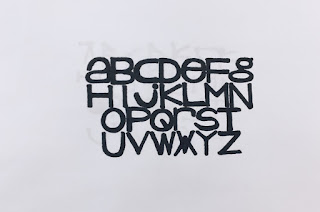
Starting off with a basic grid and a black pro-marker, these typefaces are a refinement of each other developing ideas of line and composition. The first takes Weinhart's contemporary Helvetica Font with a twist. Using long lines and wide edges, the mix of Upper and Lower Case letttering adds for a unique effect that I really like.
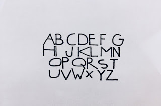
The second is a development from the first, using thiner letters with more negative space. The lettering seems very naive, almost as if it should belong on a children's book for example. Although very contemporary, the lettering in my opinion doesn't resemble the original inspired artwork which is very brash n quiet the opposite.
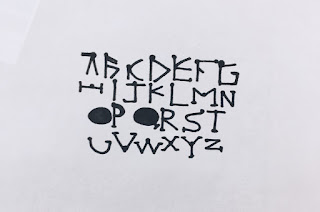
The third development uses them sharp lines and shapes found in Weinhart's composition. Filled gaps and reduction of negative space also pays homage. But once again the lettering has a sense of playfulness about it, and I believe a font more harsh with curved shapes and rendering would lend itself better.

The final lettering outcome created resembles a gothic font, curving letters and bold structure. The 'o' and 'g' lettering resembles itself hugely to the original artwork being brash, bold and very much eye catching. The font at the minute is heavily influenced in youth culture and trends, being used on such designs such as the Life of Pablo Merchandise that has been a hit within he fashion world. I will continue to develop this font and these ideas as I believe they work very effectively. Im excited to create the final edition.


