James Sommerville: Head of Design at Coca Cola
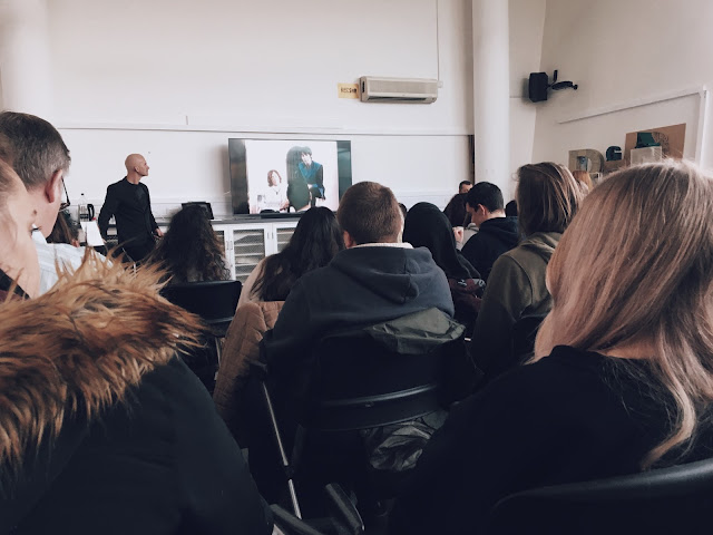
Today we had a guest lecture from the head of Design at Coca Cola. This lecture was one of my favourite lectures throughout the year and it really gave me an insight of the impact and future of commercial design. I am really interested in this field of Graphic Design I particularly love to look at commercialism, adverting and branding.

At the beginning of the lecture, Sommerville mentioned how The Coca Cola Design team works similar to the Beatles in how they embrace Heritage, Change, Brands and Feelings. We were then introduced to Sommerville's background; it was a surprise to me that he was raised and grew up in a small town not far from where I live. Sommerville found his passion for art when creating street art drawings in and around the small town of Batley, West Yorkshire. At the time, no one could find a job and was inspired by political advertising. The will to get a job pushed Sommerville into a creative duo with a friend that eventually started Attik Design - the term "Boardroom behind a curtain" was used to describe how the studio used was literally in the attic of a house.

Attik really took off when Sommerville was asked to create graphics for MTV. It was interesting to hear how a little white lie played a role in securing the job. In 2006, whilst still working around Huddersfield, a call came in from Atlanta, Georgia. The brief was to create a new identity for a Football Advertising Campaign. He combined the idea of the iconic football with the iconic coke bottle and came up with something visually inventive and creatively unique. He then moved to Atlanta Georgia and eventually became head of Design at Coca Cola when Attik was sold.
Coke, at the time, never really pushed boundaries and didn't really adapt its conversation between brand and consumer. Sommerville analysed the design, and used the concept of the red disk that that was a constant in branding efforts and that had been synonymous with Coca Cola. He systemised it, and allowed it to continue being a beacon for the Coca Cola Brand. Heritage, which has always been a big part of Coke, came from the Red Beacon; anywhere presenting the logo would allow for the customer to know that genuine Coca Cola was sold there. Sommerville knew that the design of future products needed to be cutting edge but worked functionally to express meaning towards the customer. I liked a particular quote from Sommerville: "We have to treat the product like it belongs in an Art Gallery".

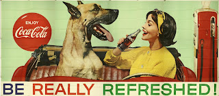
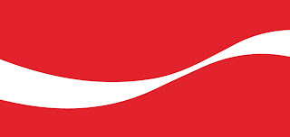
We then got the chance to look through the Coca Cola archive which in my opinion produced some very interesting designs that subconsciously I would have always been aware of. Sommerville noticed that the common theme was curves, lines, and interesting photo montages. The Coca Cola ribbon is a large part of the brand now and always has been. The 'Lippencock Ribbon' (by which is it professionally known), was created due to the negative space placed between two Coca Cola bottles placed next to each other. This branding effort, that is unknown to some people, represents a common bond, a cheers and a greeting from across the table. Reverting back to heritage, this has always been a common theme running through Coke.
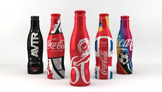
We then got the opportunity to look at the work of designers that have collaborated with Coca Cola to produce inventive pieces of design. We looked at work from Mr Brainwash, Noma Bar, Neville Brody, and Lance Wyman.
Towards the end of the lecture we came back to the Beatles analogy and evaluated how it had effected Sommervilles idea of Graphic Design when it comes to Coca Cola. Sommerville reiterated that story telling is more important than the actual finished piece itself and that starting something new isn't going to work until you actually start to do it. We were also show future bottles and branding design and the idea of how the Red Coke will eventually become extinct due to the nature at which the culture of the world today is shifting towards a more healthier lifestyle - therefore, the red disk is slowly being incorporated back into the branding effort so that the red beacon can still give customers the heritage of this very large historic brand. This idea of coming "full circle" was a great way to finish the lecture.
The idea of working collaboratively as well as the idea of changing design through political stances is really interesting to me. As a designer I am very fascinated with the idea of rebranding and the concept behind why consumers pick a particular drink; this is the majority of Somerville's work and concept.
The idea of working collaboratively as well as the idea of changing design through political stances is really interesting to me. As a designer I am very fascinated with the idea of rebranding and the concept behind why consumers pick a particular drink; this is the majority of Somerville's work and concept.
Overall I was really impressed and fascinated with the lecture throughout and it was interesting to talk about such a fascinating and iconic product. I also loved the content; I love learning more about advertising and branding as it is the field I would like to move into within Graphic Design.


