Helvetica Deconstruction Publication
In this Process and Production workshop we learnt more about Helvetica, the typeface's qualities and editing it in a way by which it looks contemporary and unique.
In previous Theory as Practice Lectures and Seminars we looked at the use of Helvetica, the way in which the simplicity and utility makes it work readily in contemporary design and how breaking it down and reversing the meaning is a very ironic way of using the famous typeface. This was same in this workshop - the degrading of the simplicity and effortlessness makes it a very interesting project to me.
Our task was to create a full colour publication on InDesign by which would either be a page layout or a cover layout. We were given the specific measurements that included the spine and asked to consider professional outcomes such as bleed, slug and layout that would make for an interesting composition.
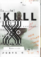
My first thought was how I was to tackle the word "deconstruction". After gaining much inspiration on Pinterest and from some of my favourite fashion-editorial publications, I decided to go down the route of deconstruction of the actual form - by which in this case was the cover, and the first thing the viewer sees.

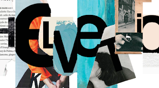
Then combining photoshop, illustrator and indesign I combined softwares to produce my outcome. This could be the cover of a document about deconstruction of type of about the typeface itself as the ironic but interesting cover radiates meaning and background. I think the cover is bold, daring and edgy and resembles work of artists such as David Carson for example.


The grunge style and disobedient approach to layout is nothing new to me as I am currently working on a similar style in my studio project when creating an aesthetic for a Penguin Book Cover and I am particularly fond of the art movement. This particular art activity became more and more popular during the 1990s. It appeared to be a very messy and chaotic kind of design. Words, textures, backgrounds that formed posters and ads for various things were designed in a very interesting and different typography style. A style called Grunge that became ubiquitous throughout the years and it became the largest, most widespread movement in recent design history. David Carson was always at the forefront of this.
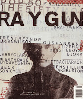
David Carson is a great example for a designer who has developed his own unique style which is so well trained, that anyone can tell a Carson design at a first glance. He was one of the most popular and influential graphic designers of the 1990s. It was his design work for RayGun magazine that really caught my eye and made me a big fan of his work and after finding a book in Library about him I was fascinated with the aesthetic and movement that his work created that has gone on to influence many other designers around the world. I admire Carson due to his daringness and edge that he applies to any project he undertakes. I think that linking this information and context into my studio project is also very important.

I therefore chose to take elements of Carson's work and implement them in my own. I used the idea of digital letterpress using layer masks to make stamp like features and ripped and torn imagery that would essentially provide as a base for the grunge and untamed aesthetic. I made sure that texture was also at the forefront of this creation; using tears and cuttings of heavily detailed texturised newspaper and magazine cuttings for example. Layering masks where heavily used to make the letters overlap from the tear to add to the abstract-like layout scheme (no real lines or following). I also used software techniques based in photoshop to edit the photos and make the colours come to life - this way of providing a base for the letter makes the piece, in my opinion, look very stylised and Carson-esque.
Overall, I am very pleased with the outcome of this project and I feel that the cover has design at its forefront. I also love the ambiguous meaning that is then known through looking further into he design.


