Creating Presentations
For this weeks process and production with Jay, we completed an overview of presentation techniques with multiple things to consider when creating PDF Presentations. I really enjoyed the initial sound of this project as it comes from an editorial and image content background.

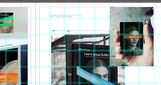
 We started by looking at Scanned images and how we can manipulate these in a way that would benefit the aesthetic of the presentation. Increasing the colour balance, auto tone and the lightness and contrast enables for the actual drawing, photo or graphic become more visually appealing. We then looked at cohesive ways in which we can manipulate the flow and narrative of a presentation and how we can create a journey for the viewer by the use of guidelines and grids. I normally use grids and guides within my InDesign Documents anyways, but looking at a different way of doing things was very interesting. I tried out a more simplistic grid approach in comparison and both worked very effectively. We then imported Jay's given images and finished with type.
Coming away from the workshop I was very happy with how it turned out. When looking for placement opportunities I found that a few were asking for a PDF Portfolio instead of an online one. I decided to set my own brief in the style of Jay's workshop by creating my own personal Portfolio using all the effects and lessons we learnt in the Presentation Workshop.
"Create a PDF Presentation that includes your own work paying particular attention to layout, image quality, hyperlinks, and typography."
Using my branded colour palette that is also used in my CV, Cover Letter and Website Design, I created a PDF Presentation. I edited every image to its best quality and included a fitting type that represents me as a designer that also has links to my website. I included a minimal type which matched the minimal layout I decided to use, playing around with the negative space and allowing for breathing space between images. I also looked at kerning and rounding off the edges of the type which in turn helped with the layout aesthetic as well as using a 3mm bleed for the document settings. I then finished the presentation with a hyperlink to my website by which It would be an interactive PDF. I also included Vimeo links to my Vimeo Videos.
Overall I am very pleased with the outcome of this Process Workshop and I have used this PDF to apply for future placement opportunities.
Here is the final PDF Presentation:


