Posts

Showing posts from January, 2017

Pinterest Boards: Industry project

Image
For the new brief on creating a new cover design for an iconic penguin book, I have set up a new board in Pinterest to gather ideas and inspiration to back up my secondary research. The main ideas I was considering when creating a collage of inspiration for 'In Cold Blood' was themes based around: Texture, Layout, Print, Police, Evidence, Crime and Non Fiction as well as looking at previous designs for the books and the Penguin Cover Design Heritage.   

Typeface Process and Production Workshop

Image
In this Process and Production workshop we looked at type and typefaces in more context.  The workshop started with two short films; one about influential typefaces and the other about inspirational opening sequences. We was then tasked to take inspiration from printed out images of artworks and architecture to create a unique and new typeface. The idea is to play around each week with a different type and to eventually build up the design to create a full Font Book.  I took particular interest in "The Swiss Poster" (1980) by Wolfgang Weingart. Initially I didn't know much about the artist but after going away and reading more into his style and teaching his work is very inspirational. Weingart  is an internationally known  graphic designer  and  typographer . His work is categorized as Swiss typography and he is credited as "the father" of  New Wave  or Swiss Punk typography. "The Swiss Poste...

Kinetic Type and Motion 1

Image
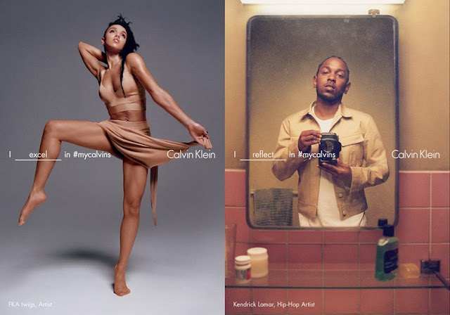
This workshop was the first of two projects, exploring kinetic typography in After Effects; focusing on Speed, motion, advanced use of keyframes, and the properties in the timeline, text tools, and the specifics of use type and text on screen. This workshop was the first of two projects, exploring kinetic typography in After Effects. Speed, motion, advanced use of keyframes, and the properties in the timeline, text tools, and the specifics of use type and text on screen.  For this workshop I decided to use the Font Futura to base my storyline and narrative around as I believe that it is one of the most used and recognisable fonts out there on the current market. I recently based my Theory Essay around the use of Futura Typeface surrounding consumerism and the brand Supreme. I then decided to base my motion graphic around Calvin Klein as I know their logo and type used in any form of branding is a version of the famous Futura aesthetic.  The Calvin Klein Spring/...

Essay Writing 2

Image
In this Theory as Practice Seminar we looked at Essay Writing again. The task for today was to bring in 3 more sentences to analyse and one full page size image to represent our extra piece of writing.  The main points from the peer feedback where positive and even though it is still rough and only the introduction, I am overall fairly pleased with the direction of my essay.  We then had to describe our picture and then guess who's description matched who's picture. The description I gave can be seen at the bottom of the scan.  Overall I am very pleased with this essay and I feel that with more time and more essay writing tasks I will create a document that will really highlight how subcultures have effected graphic design. 

Industry; First Ideas

Image
  Here are my first initial ideas for the Penguin Design award Industry Project.  When researching the three books to choose from, I ruled out the Children's fiction book; I believe the style of the book as well as the audience and theme doesn't suit my own style or influences. Above is the first sketches of ideas for 'To Kill a Mockingbird' by which the cover would tackle several themes within the classic novel; Race, Sins, Chained, Imprisonment, and Gender. My first ideas, although are rough and not definite are very stereotypical to previous book ideas and themes; the Mockingbird seems to be an easy trend that is used throughout book cover designs. This makes me want to stick with the idea of 'In Cold Blood' - I believe the imagery is more ambiguous and makes the reader think more deeply about it.  Below are the first ideas for 'In Cold Blood'. The ideas come from using the iconic house and...

Industry; Introduction to new brief

Image
Today we were introduced to our new project brief. The project, named Industry is based all around Penguin Books and designing them a new one for one of their three choices. First thoughts are to look at the book; In Cold Blood. The original cover designs as well as the intriguing plot, I believe that I could create a very mysterious and relatable book cover. The interesting and non-fictonal story behind it, has a lot of iconic imagery too to work from. Initial ideas are very much swaying towards the setting of the plot; looking at work such as Texas Chainsaw Massacre which is a novel about Ed Gein and how he murdered several people in the rural area of Texas. Both novels have a non fictional and period setting about it - set in the past in a mysterious and thought provoking location. This idea has cemented my choice for In Cold Blood. 

Branding Lecture and Seminar

Image
Todays lecture was on Branding in Graphic Design. This lecture was given by Tracey Lannon on how branding has adapted and changed our perception of the corporate world; I find lectures like this very interesting as branding is something I heavily want to look at throughout my degree. We started off by looking at famous logos, their simplicity and the effectiveness of them; how the Netlfix 'N' or the Mcdonalds 'M' is so iconic in todays modern society, it doesn't need any punchline or image to go with it.  Barbara Kruger: Don't be a Jerk Barbara Kruger: Fear and Hate We also looked at the work of Barbara Kruger who heavily deals with art and advertising combined; she creates very political and motivating peaces of art that pushes the boundaries on taboo subjects and topical themes. She talks a lot in her work about women's rights and gender equality, and at the time her work was very rev...

Guinness Factory: World of Advertising

Image
The favourite part of my trip to Ireland was visiting the Guinness Factory Tour. Half way through the tour as you work your way through the historic building in Dublin, you get to experience Guinness advertising. You fully get to immerse yourself in over eighty years of digital, print and TV campaigns around the Guinness Brand. The whole advertising concept is very traditional and most contain the iconic font and capitalised print font writing. You get the chance to walk around the room of advertisements and experience how they have developed from very traditional methods to more contemporary designs. The colours and fonts always stay true to its traditional Irish roots.  You also get the opportunity to look at the work of John Gilroy.   John Gilroy was iconic in the painting world, with a mind unlike those of his peers. Because of this, the Guinness campaigns he brought to life from 1928 to the ...

Dublin Design

Image
Recently I visited the major European City of Dublin. I travelled, with my friends, to celebrate my birthday and whilst I was there I got the opportunity to soak up the unique culture and heritage of the place. Whilst I was there I noticed a trend in expressive design throughout the city; all linking to the history of the place as well as contemporary elements too. From architecture, to street art, to signage and logos, the whole artistic branding of Dublin was very unique and special to me; I didn't expect this city to hold such a vibrance attitude towards art in this way. Here are some examples of what I found whilst on my travels around this vibrant city; 

ID Magazine

Image
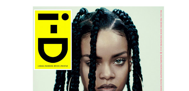
I recently came across an article online that exhibits some of the best ID Magazine covers. ID is a very famous fashion magazine that beyond the brands and clothes is a very inspiring piece of editorial for me. I am very interested in the aesthetic of fashion editorials and look-books and the way in which these communicate the clothing put in them. Recently, as part of my studio work and looking at a Sense of Place I have been looking into fashion branding and the effect that layout in particular can have upon the companies selling these clothes.  As found on  https://i-d.vice.com/en_gb/article/35-top-i-d-covers-of-all-time, here are some of my favourite ID magazine Covers;  (from left to right)  The Beauty Issue, No. 117, June 93:  "It's impossible to have a favourite i-D cover, there are too many brilliant covers to choose from. Some covers grab you the moment you see them, others pull you in when you are l...