Kinetic Type and Motion 1

This workshop was the first of two projects,
exploring kinetic typography in After Effects; focusing on Speed, motion, advanced use of keyframes, and
the properties in the timeline, text tools, and
the specifics of use type and text on screen.This workshop was the first of two projects,
exploring kinetic typography in After Effects.
Speed, motion, advanced use of keyframes, and
the properties in the timeline, text tools, and
the specifics of use type and text on screen.
For this workshop I decided to use the Font Futura to base my storyline and narrative around as I believe that it is one of the most used and recognisable fonts out there on the current market. I recently based my Theory Essay around the use of Futura Typeface surrounding consumerism and the brand Supreme. I then decided to base my motion graphic around Calvin Klein as I know their logo and type used in any form of branding is a version of the famous Futura aesthetic.
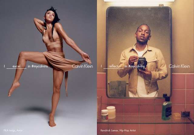
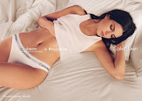
 The Calvin Klein Spring/Summer 16 advertisements are a particular favourite of mine; I love seeing them around and the use of clever guerrilla advertising in these really do help promote and sell the famous fashion house. Photographed by one of my favourite photographers Tyrone Lebon, the advertisements are full of a-list celebrities posing featuring an iconic tagline either associated with their persona or description of style within the campaign. The idea is very clever - the design is almost as if the celebrity has placed the word in the allocated slot themselves that summaries that they are only like this when wearing the infamous clothing brand. I decided to pay homage to this advertisement by using it in my work; to create almost like a quick 10 second editorial campaign that will promote the clothing brand through short snappy phrases that would also pay tribute to the use of Futura by replacing one of the words with the fonts name itself.
I therefore decided to create my mood boards pre workshop that I was then able to import into After Effects. I the used a series of keyframes, transitions, audio clipping, markers, and type and text. I feel like each time I produce a piece of motion graphic work I am developing more and more skills and I am beginning to really enjoy using the software.


I really enjoy the outcome of my piece and I believe that the mix of editorial advertising as well as fashion marketing fits my brand really well. I also believe that the video hints towards paying tribute towards the Futura Typeface as a saying that non of Calvin Klein would be possible without it. I am overall very pleased with this outcome. I am going to try and create another version of this that is slightly longer and intersects more words surrounding the iconic typeface that can be placed into the relevant "blank spaces" in the campaigns.
Here is the final Motion Graphic Video Advertisement for Calvin Klein that celebrates its use of Futura:


