Typeface Process and Production Workshop

In this Process and Production workshop we looked at type and typefaces in more context. The workshop started with two short films; one about influential typefaces and the other about inspirational opening sequences. We was then tasked to take inspiration from printed out images of artworks and architecture to create a unique and new typeface. The idea is to play around each week with a different type and to eventually build up the design to create a full Font Book.
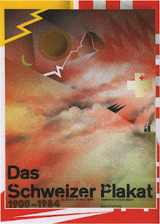
I took particular interest in "The Swiss Poster" (1980) by Wolfgang Weingart. Initially I didn't know much about the artist but after going away and reading more into his style and teaching his work is very inspirational. Weingart is an internationally known graphic designer and typographer. His work is categorized as Swiss typography and he is credited as "the father" of New Wave or Swiss Punk typography. "The Swiss Poster" came about in the 1980's when some young Swiss designers thought it would be essential to move on from traditional industrial design - becoming experimental with a loose grid, he overlapped images, used enlarged half tone patterns, and graphical visual images.
The final image is a very expressive and contemporary image of colour and shape using a simple helvetica bold font. I began to copy the 'a' in the font and replaced it with the iconic background of the artwork, I also recreated the simple helvetica font and played around with layering and block colour. The overall outcome was intriguing to me and I am excited to work on this idea further to see what final outcome can be produced.


