The Hand
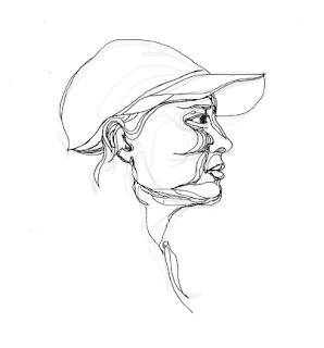
Workshop three of AfterEffects was about the hand, hand drawing and how we can use manual effects to enhance designs digitally. We were told to come to the lesson with three hand drawings of some form, each slightly different that would allow for us to layer the images and ultimately make them move over a 10-second sequence. We were also told to bring a background which would hold some form of context that would allow us to shape the composition in an exciting format.

I decided to look into the work of Kris Trappeniers. The stencil artist, Kris Trappeniers from Belgium, creates fascinating portraits using only a scalpel and a single piece of paper. Initially, he establishes loose portraits on paper, and then he cuts each paper-cut by hand with an X-acto. Afterwards, he uses the spray to paint them. The use of various line weights and the mixture of positive and negative space are the main elements of his art creating really vivacious images.

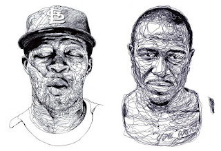
Using his inspiration, and using my studio photography work, I decided to take influence. Working in different mediums, I found that a Biro would be the most effective method of creating these highly detailed line drawings. The images are then drawn slightly different, and by using layout paper, I could see how the layering of the lines would allow for a practical outcome. I then came up with this concept of graffiti taking influence from the urban background. I found this free textured wall aesthetic that I would use as a backdrop and a font that would look like it was being tagged onto the wall. We then looked at a music video by Forest names Just one Day that would allow us to thoroughly understand the type of outcome we will be creating.


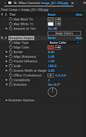
Then, using photoshop and illustrator, we edited our images. We then imported them into After Effects and removed any white background. Using different merging techniques and using different all my artwork, we put together the animation. I found that I learned a lot of new skills and features that I will certainly use again. I loved the technique of being able to make the font look like it was writing on the page.
Next time, I am going to find a more efficient image that will allow me to work with a more broader concept. Using this different imagery would let for me to also look into famous quotes I could use or perhaps even slogans instead of just a simple name. I will also consider the compositional layout but with a similar colour palette scheme.


