Posts

Showing posts from February, 2018

The Stencil Part 2

Image
In the 5th Self Publishing Workshop, we developed ideas again surrounding stencils but were influenced by type. In the workshop, we were given three different types and we were asked to pick certain parts of the type to deduct. We would draw them on the card and then later cut them out to create a stencil for print.  I particularly focused on Baskerville and Din, picking out certain parts of their typeface that were unique; I focused mainly on the loops of the Baskerville 'G', the bracket on certain capital letters like the Baskerville 'H', the ascenders of Din's 'H' and 'L' and the tail of Din's 'Y'. I also removed certain parts, taking away the ascender on Din's 'K' and focusing on the link or neck of the 'X'.  It was then my task to think about a unique layout composition that I could follow that would allow me to inventively work with these shapes. I decided to try and make different letters and shapes inclu...

Website Design

Image
For my Placement Year, I have decided to create an online presence by sharing my work online through a website. Keeping in line with my CV Design and Cover Letter example I have decided to add the same font, colour scheme and layout design that should hopefully marry it with the sort of brand I am going for relating back to the type of designs I enjoy creating.  Here is the rough outline of my website design. My website is: www.joemitchell.design

3D Project

Image
Workshop 4 in the 6 workshops for AfterEffects was all to do with z-space, cameras, and animation in 3 dimensions We also developed techniques surrounding advanced compositing, textures, working with visual styling, production, and project builds. Before the workshop, Sara showed us lots of very inspiring projects, one being a music video by MGMT called All I Ever Wanted. I particularly loved the way in which textures and roll on effects were used to tell a story. MGMT - All We Ever Wanted Was Everything from oneedo on Vimeo . We were told to focus on textures, vector shapes, and interesting themes that we could explore through this motion of a narrative and the use of a flowing video animation. We were told prior that we would look into this idea of images rolling onto the screen with shadows and textures all interlinked to create a unique and inventive outcome. We were also told that the better the artwork before the more interesting outcome.  I ...

Infographics Motion

Image
For this Process and Production workshop, we worked with a live-brief, The University of Huddersfield, by which collectively we designed a motion graphics advert for the University.  This was a project about working with data and statistics in After Effects. The workshops will be a live project, working on one of three films in collaboration with Heritage Quay. The first film is about Heritage Quay, the second is about the Rugby League Collection, and the final is about the collection about the University. Our group was in charge of producing work for the third idea; the one surrounding information about the University that would be screened for viewers and prospecting students to see.  In the workshop, we were shown ways to handle data, effects, masks, and transitions, to project build and create live material. The brief was simple; to create a ten-second animation that would piece together with the full class to create a narrative that would promote and celebrate...

Speculative Futures; Rebranding the Light Phone

Image
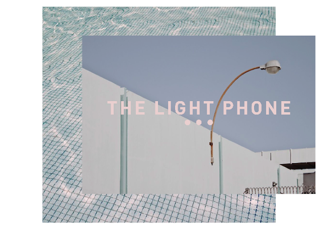
Now my research is complete it is now time to strip down the Light Phone so that I can think about a rebrand for the market identity. Taking into consideration minimal shapes and numbers found on the device as well as a contemporary font, I have developed ideas that could possibly be used for a rebranding opportunity. I took the cross, the triangle, and the numbers listed above.  After speaking to the tutors, we both agreed that the concept needs to go deeper than it already is. I then came up with the idea to research into the 5 senses; taking on board this concept of appreciating your environment rather than what is on your smartphone. I now want to go out and take my own photography, looking more into this idea of the 5 senses which will hopefully add a more ambiguous feel to the project. I also want to look further into the text, making sure that the kerning and letter form is 100% correct so that when layering it above an image it will look its best. 

Visual Analysis; Final Product

Image
Here is the final product of my Visual Analysis. It is an Exhibition Report that would be featured in System Magazine that would detail the collaboration project between myself and IKEA named 'The Flatpack Consumer' by which would express special consumer traits that attract customers to IKEA. The final finished piece is inspired by all things Scandinavia; from the type, the illustrations, the iconic IKEA tag and booklet branding and the simple and minimalist aesthetic with pastel hues throughout.