The Stencil Part 2
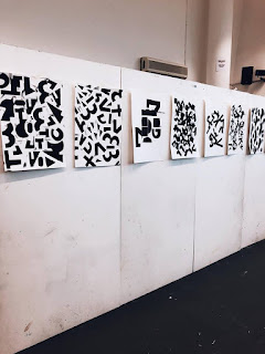
In the 5th Self Publishing Workshop, we developed ideas again surrounding stencils but were influenced by type. In the workshop, we were given three different types and we were asked to pick certain parts of the type to deduct. We would draw them on the card and then later cut them out to create a stencil for print.
I particularly focused on Baskerville and Din, picking out certain parts of their typeface that were unique; I focused mainly on the loops of the Baskerville 'G', the bracket on certain capital letters like the Baskerville 'H', the ascenders of Din's 'H' and 'L' and the tail of Din's 'Y'. I also removed certain parts, taking away the ascender on Din's 'K' and focusing on the link or neck of the 'X'.

 It was then my task to think about a unique layout composition that I could follow that would allow me to inventively work with these shapes. I decided to try and make different letters and shapes including a number 3. I also tried to layout in a grid formation, to see how the new distorted fonts would compositionally work next to each other. Using a stencil and black paint, we stencilled them out and created a unique composition.
 I want to develop these ideas further and create real vector shapes with them on illustrator that could be used in branding and future project development. We also held a mini-crit, by which we analysed different peoples work and discussed what made them effective.

After the workshop I decided to go away and pick up certain shapes that I liked when I produced work. Exploring within illustrator I managed to create very simple shapes and vectors that could work as logos very effectively. I really liked this 'i' shape. Matching this with different colours and a contemporary trend aesthetic in such way that botanical gardens are nowadays it works very well. I will try and experiment more with the idea of shapes for possible logo branding opportunities.


