Convergence, Form and Content: The Medium can have a Message
 |
| http://cdn8.openculture.com/wp-content/uploads/2016/10/28000744/mediummassage.png |
In this seminar we looked into Convergence, Form, and Content.
Convergence is the forming of two elements; a good example would be a smart phone as it includes many operational devices such as a calculator, phone and camera in one. Convergence, when spoke about within design, is the meeting point in which ideas and functionality come together.
We also looked at form and content and how these play a vital role within Graphic Design:
- Form is the style and techniques or media used to create the design
- Content is the works meaning or context - what is it about?
 |
| IBM Logo by Paul Rand |
Paul Rand's 'IBM Rebus' (1981) is a picture that you decode with your mind and a riddle that gets the viewer thinking. This is an example of a visual metaphor about communicating a message. We also analysed Marshall McLuhan's 'The Medium is the Message' by which he talks about how the medium (within every piece of artwork) plays a vital role in how the artwork is perceived. He also speaks about how the medium holds more value too - a prime example would be how we would naturally read something differently if it was printed in a text-book than if it was printed in a magazine.
 |
| Page Extract from The Medium Is the Message (1967) |
This idea of keeping options open to interpretation is what I think is very influential and motivational. The idea that the viewer, without reading the original manifesto that the book is based on, can almost have their own, personal viewing experience. The page itself, where the hands are reading the book, with the words "the book" at the top, almost works as a pause in the script. This clever, yet, mysterious image of the two hands, almost makes the reader look for then inspiration inside themselves and ask the question "why am I reading this?".
To really develop the idea of Convergence and the bridge between form and context, after the lecture I decided to go away and research into how this idea of a person reading the book placed across the main composition of the actual page can have different influences on different people. I sent a picture to my friends and family and asked them their first ideas of the page and what would be their response if they saw it in a book.
Here are some of the replies:
"I'd feel strange, I'd feel as if someone was watching me or mimicking what I was doing. I'd also question why it is an empty page and why the person in the shot is reading something that isn't there."
"I think its weird because the page is empty and the idea that a person reading a book in a book with nothing there is complicated. The irony of a book within a book is throwing me off."
"I like the idea of it, and I also like the way in which it makes you think about what your reading and whether or not it makes any difference of means anything to you in your life. The hands make it seem real and authentic"
The three observations of The Medium is the Massage book scan show how Convergence can be simultaneously effective across a broad range of audience. I also love the way in which it sparks opinion which I think most pieces of design should do.
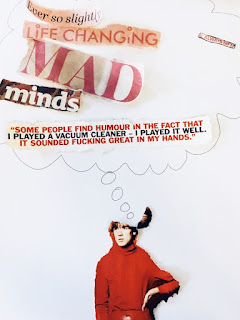
 For our task we was set with the challenge of creating a piece of work that demonstrated meaning and context with a very limited piece of medium. We were given newspaper, magazines and blank pieces of card. As a group we created an image of a person thinking about different words or ideas extracted from a newspaper. We looked at it from a designer's perspective extracting words such as 'Life-changing', 'Mad', and 'Minds'. I think that all these words have some form of relevance to the world of art and design: your mind is a great tool in creating new and exciting ideas as well as being influenced by other stimuli. Like the work we looked at in the seminar, this work is up for debate and the viewer can use these words to relate to a different element in their life.

