Rotoscoping
In today's Process and Production, we worked with Rotoscoping to produce some fun and creative animations. The session was aimed to introduce us to Masks, layers, looping comps, textures, backgrounds, and track mattes, ideas, about the footage, and time-remapping.
We, first of all, looked at inspiration from various after effects designers. We looked at the work of Drew Tyndall who creates some very original workaround motion graphics. His work is super innovative as it combines the use of animation and brilliantly textured aesthetics that all come together to make a significant outcome. I was particularly interested in the Music video for 'Something To Believe In' from an upcoming album, Home of the Strange.
We also looked at a piece of work called Tango by Zbigniew Rybcynski, 1980, which was the first real example of rotoscoping by combining looping scenes to fit an overall very active view. This idea of repetition and flow and being creative in what you produce related to the workshop.
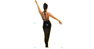
 We started by taking footage to use for the workshop. The idea was to make a 1-second clip that could be linked and looped in the same way that a GIF works for example. After taking footage in the workshop, I decided to use already filmed footage from a festival I attended earlier on in the Summer. The footage is of my friend walking through the festival arena. I thought this would be an inventive idea as I could then tailor the workshop to a festival or summer aesthetic.
 We then downloaded the footage and opened it up in AfterEffects. Working with 25 Frames per second, we worked with many different techniques within the software to create our final piece. We used the pen tool to cut out the shape of our moving person. I also learned many keyboard shortcuts that help me with working quicker and more efficient; such as (H) that enables to move the composition without moving any objects and (CMD - arrow) to shift keyframes across. We also looked at coding and making it run across the whole sequence. We then learned about applying textures to the background or image to add to the aesthetic.
After deducting the moving image from its background, we were then tasked with thinking inventively and outside the box by creating an overall vision that fits our chosen area of design that links to our practice. I decided to base my idea and theme around this festival vibe and summer idea with also taking in inspiration from the designers shown before the lesson.
Corporation Pop

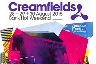
 I explored many different ideas and concepts. I decided to look at Corporation Pop who is a design agency that built the brand around the festival I attended back in the summer. In late 2008 they were appointed to deliver a multi-channel campaign for Creamfields 2009 which was produced in print, press, outdoor and online and ran for six months. The campaign was an undisputed success – the festival sold out for the first time in its history, attracting 60,000 attendees. Cream was so pleased that they commissioned them to deliver the Creamfields 2010 campaign – and they became the first agency in the festival’s history to be appointed two years in succession. The 2010 campaign, which built on the creative established in 2009, proved to be equally successful and again delivered a sell-out festival. I took the idea of their branding ideas and themes based on a funky and industrialised vibe and tried to recreate it using illustrator and photoshop. The branding included a lot of imagery of previous festivals, layered over funky shapes and icons. The branding was also matched with lines, dots and exciting textures that were all colorful and iconic. The use of these lines, photomontage and shapes all related around the structures, fashion and look of the festival: this instantly resonated with me as I love working around conceptual design and looking at smart branding that surrounds culture and art all around us. I, therefore, chose to take this concept and apply it to my plans.
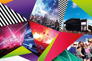
I chose to recreate these ideas and themes within photoshop, using my photography and shapes based on Corporation Pop's branding idea I think I created an exciting outcome. I also used free internet textures to layer over the images and shapes and my rotoscoping person to work in the style of Drew Tyndall. This, in my opinion, created a new origami feel that I think pays homage to both designers.
I do think that If I were to recreate this, I would spend more time working on a concept idea and initially plan out the storyboard and visual content of the designs. I ended up deleting a lot of the Creamfields inspired designs so therefore I'd like to try it again to show a developmental process. I would also use more rotoscoping ideas to make a fun-filled advertisement brand that would work in my concept design style as well as go out of my comfort level to produce work for a unique company that I have never designed for.
Here is the final composition:
Here is the final composition:
Rotoscoping Workshop from Joe Mitchell on Vimeo.
After leaving the workshop I really wanted to look into how I can brand this aesthetic and I really wanted to visualise what this would look like in a real-life scenario. I really liked the idea of using this shaping and paper feel about the brand in the same way that Corporation Pop has. I have put together a visual representation of how this would look in the real world.


