Cinema 4D as a Design Tool (3)
In this Process and Production workshop, working within the software of Cinema 4D, we learnt about the creative nature of prototyping and how a realistic and appropriate image can be created through Cinema 4D software. This opened my eyes to the software and the type of model it can produce.
We started by professionally setting up our project folders efficiently to keep artwork and output separate. Through illustrator, we then sourced the artwork and changed the file type to illustrator 8 so that we could edit through Cinema 4D software. We also changed the centre direction so that the shape would fit within the new software.

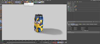
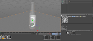
We then merged can shape and create two Lathe Nerbs which gives the overall can shape. We then added a background object, a floor object and a named material object. We then added the material to the floor and background. We then adjusted the mapping to add the overall tint and can aesthetic to our shape. Through the use of test rendering, we could see the look of the can which did look reasonably realistic. We then had to create the can top material which and add lights which would enable for a better prototyping setting. We later learned more about cloner settings and how these can produce a unique effect that makes an artwork fit around a shape, almost like the branding for the bottle. When I get a moment, I am going to try and design some unique and fitting branding to develop this idea as the artwork we used was just a simple basic design to show how we would use this technique in the future. We then rendered, looked into specific render settings to get the best possible outcome and then rendered the image, choosing a preferable angle. Here is my final can image:
Part two of the workshop we then moved onto bottles which were a lot harder due to its nature of having reflections and contents within it that could be seen through the translucent quality of the material.


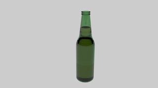
We edited again through illustrator and inputted the shape into Cinema 4D. We then figured the form and added lights, floor and background as usual. We then added the glass material; using colour (green) and through the transparency tab and refraction, we created a shape and material that would look realistically like a bottle of beer. Turning the absorption to white and a copy material to yellow we then made the bottle look more and more realistic. Looking more into reflectance materials we also added a brown colour to add to the prototype. Once again, we implemented the given label which, as said previously, I want to develop to look even more useful. The bottle top was unusually hard, and through using the spine tool and circle shape with editing around a radius adding the individual grooves, we managed to create a realistic looking form. We then added lights and positioned the bottle efficiently ready for render queue.
Here is the final bottle render;
We also got given the instructions to try cartons by which we didn't have enough time to complete. We used a combination of two software within this workshop and produced a lot of work using a lot of skills within this design workshop which I was really pleased about. To develop these designs, I am going to look into developing these labels to make my own design prototype and then finish by applying this to these designs so that the prototype is my own creation.


