Creative Exchange Week: InDesign Workshop
I decided to attend the InDesign workshop held by Aidan and Rob during Creative Exchange Week. I have slowly grown a love for the software over the past two years, and I regularly want to learn more when it comes to knowledge of InDesign. The software plays a vital role in the work I create, the layouts produced and the final outcomes of most of my projects. I am fascinated by editorial design, and grid layout, therefore, I thought that this workshop would be fit in perfectly with the kind of designs I want to look closer at.
 We started off by looking at the work of Massimo Vignelli. Vignelli is renowned for taking the baseline grid and exploring the use of it within a design, he explains how he begins a book design by laying paper over a simple grid for positioning images and text, which can't be seen in the finished article. "The grid is the underwear of the book," he says. "You wear it, but it's not to be exposed." Vignelli sketches the images by hand when mocking up the layout as he believes it's faster for him than using a computer. He compares the design process to make a movie. "The scale and the pacing of the images make the book, it's just like a film," he says. "The scriptwriter is the author of the book, and I'm the director and cinematographer." Vignelli is a very influential designer to me, and I am always reading books on how to maximise the use of the grid within different areas of design.
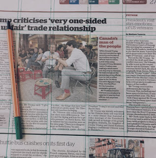
  We then decided to look at familiar grids found around us. Last year, when designing a project based on editorial and design I completed the same activity. We observed newspapers and magazines and drew the baselines used on top of these to really understand the editorial designers choice of a grid. Doing this exercise really enabled me to visualise a designers motive when creating artwork. I think it is also interesting when comparing the different form of mediums such as the difference in the grid between magazines and newspapers. The mixed-use of photography and the varied use of text really does change the nature of the grid and the meaning behind the different amount of columns n gutters for example.
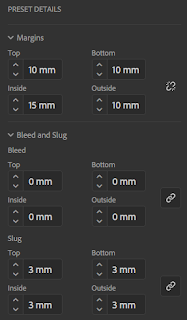
We then took to the computer to start composing our own idea of an editorial InDesign document by which we could play around with the use of gutters, columns, grids, rows, bleed and layout. We set up a standard design, just smaller than A4, using commonly found measurements for the type of document created. It was also noted to me that before creating our document, it was worth thinking about breaking the rules a little when it comes to page margins and layering things based on how reading the text actually functions; for example, shifting the whole page across slightly to fit with binding measures or shifting it over to enable the reader to thoroughly read the full extent of the page.
Below shows the document layout created:


We then looked at different sources of inspiration that would inspire our designs. Being a subscriber to many editorial and fashion magazines, I already knew a few iconic designers that I could take inspiration from.
A Practice for Everyday Life
A Practice for Everyday Life is a graphic design studio based in London. Their work includes art direction, identities, publications, exhibitions, type design, signage, packaging, and digital design. They have built a reputation as an internationally renowned and sought-after design practice. Their work is heavily focused on editorial and design, and their layout and scheme are fascinating and inspirational.
Matt Willey
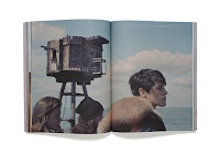
During his career, Matt Willey has gone from small start-up projects like Zembla, Elephant, MAP and Plastique to working as Art Director at The New York Times. Not to mention launching his own magazines - Port and Avaunt - along the way. His work is very inspiring to my own, taking into account his incredible and sophisticated design layout schemes and magazine editorial skills. His work is massively influential, here's a selection of my favourite pieces from his portfolio;


Wednesday London
Wednesday’s relationship with Calvin Klein delivered a series of campaigns that returned the brand to prominence with global audiences. Combining the power of truly integrated advertising and communications with the brand’s unmistakably intriguing character, the campaigns set new benchmarks in social engagement and awareness over a two-year period.
I then started designing the work I would put into my editorial design. Using my two favourite fonts, Din and Helvetica, I decided to work in the style of my chosen designers to hopefully create an interesting composition with an ideal layout. I also set up my own bespoke grid, using columns and picture lengths to my grid layout selected therefore working in the style of Vignelli.
I then put all my work together, as well as mocked it up efficiently to produce a final and finished response. Overall, I think that the session taught me about the importance of layout, the ideas surrounding the image with text and the beauty of simplicity. Being obsessed with this way of working and being interested in this particular area of graphic design, I will continue to develop my skills within Editorial and Layout and try and push the boundaries when it comes to new and fresh ideas.
Here are the final outcomes of the workshop;


