Posts

Showing posts from January, 2018

Self-Publishing; The Stencil
Image
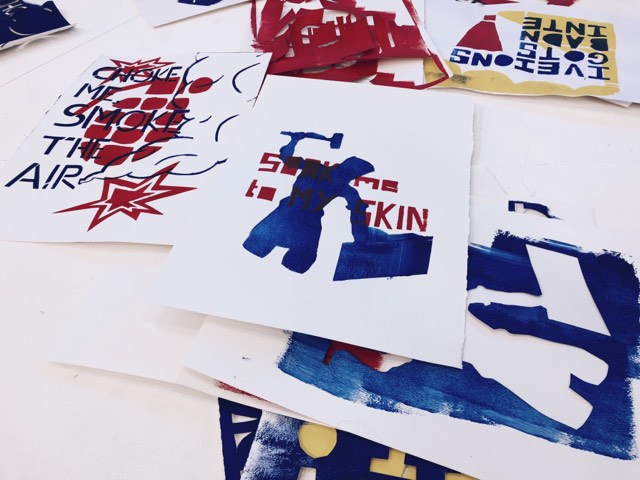
For this weeks process and production lesson we were learning about stenciling and it impacts upon design within history. We particularly looked at the time period of 1968 by which there were French Student Riots. We were simply asked to choose an image at random and choose a line from a Stone Roses Song that would come together to form an image that we would stencil on top of each other. Only allowed to work within the three primary colours, we all, in turn, chose a word and a sentence and created two stencils that we would later layer on top of each other to work in this iconic style.  The image I chose was Soldier and the word I quote I chose was "I'm throwing stones at you". 

Basic Video Editing

Image
In Lesson 5 with Jay, we looked at Basic Video Editing. Using Premiere Pro CC as the main software, we learnt basic video editing techniques that would enable us to edit future projects effectively in Premiere.  We first of all started by setting up folders professionally that would enable us to work effectively. Creating a new project and then a new sequence helped us set up the initial stage. We then set up an HD quality screen by which we would be able to work to our full potential. We then started the first of our slideshow by importing all of our given images. We had to scale it to 63% and position it effectively so that it fits correctly on screen size. For the first image, we added a blur so that text would be readable and added a font so that the slideshow could have a title or context to it. I chose to add the DIN font with my name in my branded pink colour scheme that I use throughout most of my work and CV that is a kind of branded trademark of mine. Thi...

Cinema 4D as a Design Tool: Character Creation

Image
In this workshop, we used Cinema 4D once again to construct and develop a model of a simple character design. The lesson started once again with us all organising work folders, arranging assets into place and opening needed notes and instructions in order for us to work professionally and to industry standard.  We started off the workshop working with shaping; building and developing this character shape from a cube. We then added arms and used a subdivision surface that enabled us to smooth the character out into a more effective and realistic character model.  Once that was complete we were then asked to add facial features. We were also asked to add colour. Throughout the whole year, I have been developing a brand of myself with a muted pink colour scheme that is minimalistic and contemporary so I decided to carry this through on this character design.  The final result is effective and interesting and I feel like I could work on this further to develop it in ...

Speculative Futures; Developed Ideas of a Rebrand

Image
When starting upon thinking about ideas for a rebrand of The Light Phone, I found an article online that is all about an ideal user experience. The article talks about a speculative future of design that combines Contextual, emotional, anticipatory and ethical design. I researched into each of these themes extensively and it produced some interesting findings.  One that I found most interesting was anticipatory design. Researching this idea brought me upon an episode of Black Mirror called Nosedive by which they used anticipatory design to predict that the future would be this pastel-filled the happy world that is run by technology and this social media presence. I researched into this pastel-hued world and it really is a trend in today's aesthetics - being voted colour of the year and being found among multiple platforms - from film to photography. The trend of this opened up more research to which I found artists that work with this colour to produce interesting images based o...

Visual Analysis: Photoshoot and Illustrations

Image
  As part of my visual analysis and producing a project based on the history of Scandinavian Design I have decided to creatively direct 'The Flatpack Consumer' which is a collaboration with Swedish Furniture Company IKEA by which it would highlight their consumer market through the use of clever inventive designs. I have decided to take their iconic designs, which I have already researched thoroughly, and produce a tag and manual that I would attach to the 'Consumer'. The consumer would then be photographed, similar to that of a piece of furniture. The whole thing should highlight certain character traits about the consumer that is interesting and unique. The whole project is going to be documented in a report form similar to that of the Off-White collaboration with IKEA that was part of high fashion magazine System. The whole photoshoot was uniquely directed to fit Scandinavia; from the modern pastel coloured clothing worn to the blank, robot-like stance on each ...

Speculative Futures; The Light Phone

Image
When researching the future of design, rebranding and identity, I have come across a unique contemporary device that is a future development of the smartphone - I believed it was relevant research due to the extensive research I completed on the branding identity of Apple.  The smartphone is a futuristic device that links to your smartphone. It only accepts calls and is designed to enable us, as humans, to appreciate our surroundings more rather than looking down at our phones. The idea is that, in the future, everyone will leave their smartphones at home and opt for the smartphone for a social-media less world. I thought that this was a unique spin on speculative futures - many other people I found were looking into an increased social media world whereas I wasn't.  After increased research, I then looked at the branding identity which in my opinion looked dated and odd in comparison to a device that looks very futuristic and like something that would be found...

Placement Preparation; matching Cover Letter and CV Design

Image
Coming up to Placement Year I believed it was important to spend some time developing and working on my CV, Cover Letter and Website Design. I decided to have a unique running brand throughout so all matched and all fit within a particular design scheme. Looking for inspiration found online and working out what I wanted to portray I have created an online personality that I think works well with the style of design I would like to produce on Placement Year.  I am really interested in minimal design and branding; I'm obsessed with slick contemporary design that is full of concepts and background. I am also interested in editorial design, the use of negative space and ideas surrounding fashion branding and marketing. I am also a big fan of Scandinavia and the design aesthetic that comes from this region. Taking all that into account, I have opted for a very minimalistic and fresh design aesthetic; taking this pastel pink hue colour scheme throughout the 3 design ideas ultim...

Visual Analysis: The Flatpack Consumer

Image
Basing my essay on Scandinavian Design and how we as a country crave another culture, I have decided to base my visual analysis on a "flatpack consumer".  The idea will surround the consumer and why we choose to shop at Scandinavian Design stores; breaking it down visually through the use of design as compared to my essay. I will first start to shoot the "consumer" within a product photography background using a simple 3 point lighting scheme. This is the initial "product". I will then photograph this consumer around the famous Swedish store, using one of their iconic Frakta Shopping bags and analysing the Swedish products. This will then be displayed in a report form using IKEA's famous Verdana font and using the blue and yellow colour scheme that is similar to what is in systems bi-annual IKEA c/o Virgil Abloh Report. I will also create a handy flatback book that will go along with the consumer by which will document further the idea surrounding ...

Speculative Futures: First Thoughts

Image
Today we were introduced to our new brief which is surrounding Speculative Futures. First initial ideas that I had all related back to the concept of the future of Graphic Design and what the subject could evolve to over the next ten years for example.  I started by researching this topic and there were a few examples of articles surrounding the future of graphic design. They all related back to this idea of Rebranding which is a new marketing technique that some companies are employing which is the process of stripping the brand right down to its bare recognisable essentials. This process, which is adopted by many brands such as Apple, McDonalds and Nike is a common feature in their identities.  I then used apple as a case study to research deeper into the way in which this big company has done this - from a minimalistic design that now has such an emotional experience with the user - from the opening of the box to use it in social events, there's a big e...