Posts

Showing posts from February, 2017

James Sommerville: Head of Design at Coca Cola

Image
Today we had a guest lecture from the head of Design at Coca Cola. This lecture was one of my favourite lectures throughout the year and it really gave me an insight of the impact and future of commercial design. I am really interested in this field of Graphic Design  I particularly love to look at commercialism, adverting and branding.  At the beginning of the lecture, Sommerville mentioned how The Coca Cola Design team works similar to the Beatles in how they embrace Heritage, Change, Brands and Feelings. We were then introduced to Sommerville's background; it was a surprise to me that he was raised and grew up in a small town not far from where I live. Sommerville found his passion for art when creating street art drawings in and around the small town of Batley, West Yorkshire. At the time, no one could find a job and was inspired by political advertising. The will to get a jo...

Kinetic Typography 2: Z-Space

Image
In this workshop we learned  about 3D space - exploring depth and the z-axis in after effects.  C himamanda Ngozi Adichie's Speech used in Beyonce's World tour Prior to the workshop we were asked to prepare a text, quote, or song lyric to work with which we would then move, rotate and manipulate with Z-Space using After Effects. I chose to use C himamanda Ngozi Adichie's motivational speech about feminism - it has been a hit globally, with thousands of hits on Youtube and even an appearance on Beyonce's 2013 Album. The speech talks about women rights and the role of women in todays society so I believe it is a strong and powerful message to use within my work.  I inputted each word by word and decided to move past the recommended 10 second video so that the audience can really get a full grasp of the quote and the full nature of my intention which was to manipulate the words to what...

Second Type Workshop

Image
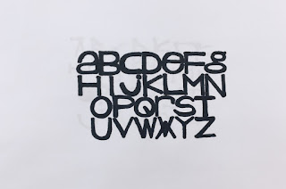
Working on designs created in the last Process and Production Type workshop, I have now developed 4 more types inspired by the shapes, lines and typefaces used in Wolgang Weinhart's iconic piece of design.   The piece is renowned for using sharp lines and a simple swiss Helvetica Font. I have recreated this in a development over 4 quick typefaces.  Starting off with a basic grid and a black pro-marker, these typefaces are a refinement of each other developing ideas of line and composition. The first takes Weinhart's contemporary Helvetica Font with a twist. Using long lines and wide edges, the mix of Upper and Lower Case letttering adds for a unique effect that I really like.  The second is a development from the first, using thiner letters with more negative space. The lettering seems very naive, almost as if it should belong on a children's book for example. Although very contemporary, th...

Essay Writing 4

Image
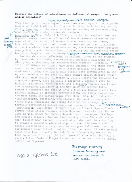
In this final peer editing feedback before the Formative Deadline, I got the chance again to receive valuable feedback regarding the direction of my essay. I worked on feedback from last time and included images and a reference list that although isn't complete allows me to include the site references that I have gathered.  The main feedback from my peer editorial was that I had interesting points, captivating facts and figures, well informed quotes, and  good links to design that overall answers the question at hand. Feedback for improvements included considering the opening and how it can be even more effective. I think that the peer editorial feedback has been very effective in growing my essays content and working week by week has definitely taking the stress off other modules. The topic I have chosen has also been very interesting to me and I have found myself becoming more and more immersed in th...

Helvetica Deconstruction Publication

Image
In this Process and Production workshop we learnt more about Helvetica, the typeface's qualities and editing it in a way by which it looks contemporary and unique.  In previous Theory as Practice Lectures and Seminars we looked at the use of Helvetica, the way in which the simplicity and utility makes it work readily in contemporary design and how breaking it down and reversing the meaning is a very ironic way of using the famous typeface. This was same in this workshop - the degrading of the simplicity and effortlessness makes it a very interesting project to me.  Our task was to create a full colour publication on InDesign by which would either be a page layout or a cover layout. We were given the specific measurements that included the spine and asked to consider professional outcomes such as bleed, slug and layout that would make for an interesting composition.  My first thought was how I ...

Essay Writing 3

Image
In the 3rd Essay Writing task we were to  bring in a more developed piece of writing that was then peer analysed. The feedback from these sessions in my opinion is really helpful and getting a different person's insight each week is a new but helpful experience when writing the essay question.  The main feedback I got from the essay was that that the opening was strong, audience is gripped from the start, the use of facts and examples with rhetorical questions are effective and thoughts and opinions are used well. It was noted that I need to work on creating a reference list to match in-text referencing and that I need to expand on some points and messages. 

Create a piece of Artwork that represents your essay question

Image
For todays lecture we were required to create a piece of art in response to our essay question. The mood-board I created documented the visual relative stimuli that I have used to inspire the narrative of my essay response. The top of the mood-board documents the start and the flow describes the direction of what I want to talk about. Therefore, I will start with a broad description of Supreme and Skate Subculture and how they both go hand-in-hand. I will then talk about the work of Kruger and her influence in design. I will then all about Paul Renner Font and the Supreme Branding through Studio 191. I will then talk about branding schemes such as the Terry Richardson Campaigns. I will then talk about how other artists and designers such as KIDULT are responding to the effect of the hype of Skate Culture. I will then be able to compare Supreme's full art direction to other skate brands such as Thrasher. The minimalist layout of t...

Industry; thinking about layout

Image
Unexpectedly, I have really become fascinated with layout and design and the way in which layout plays a vital role within Graphic Design. It also plays a pivotal role in how you communicate your ideas; for example the layout of portfolios or presentations.  During my studio session, in a conversation with John, I was shown work by a previous student. It was clear that layout was at the forefront of the students work; being easy to read and thought provoking.  This was very inspiring to me by which I went off and created a simple basic grid, based on everything I have learnt so far when it comes to layout. This grid would enable me to input work to make a final document that I can present as a final piece. 

Interactive PDF

Image
In this Process and Production workshop, working with Adobe PDF, we learnt how to create and new and inventive way of displaying design work either for personal presentation or for future interviews etc.  We learnt to use the full effects of a PDF document and the different ways we can make it interactive for the user to implement. We incorporated buttons, audio files, video and buttons which all added to the user experience. The idea was to show us the basics for us to go away and create more unique and creative ideas with the software. I had no idea of the complexity of PDFs and it is definitely something I want to learn more about in the future.  This Process and Production really helped me to develop my skills in the PDF software. I did however feel I got lost near the end of the workshop and the final outcome couldn't be viewed completely. I will try and recreate another ver...

Library Session; searching for inspiration

Image
Today we got some free time in our studio session to explore the library and search for inspiration. I took the time to look for inspiration on my studio project - looking at David Carson and Layout books. I also took the time to search for inspiration on my essay writing and including quotes from books in relation to text I have already wrote. For example, I have looked at books on Barbara Kruger- the main inspiration for Supreme in designing a political and minimalist brand aesthetic. Here is what I have found; David Carson; Grafik Design After The End of Print Designer and the Grid Barbara Kruger; Modern Art Oxford Barbara Kruger; Thinking of You