The Poster
In today's second Self Publishing workshop we looked more into the use of typography within publishing and how these can be manipulated to our advantage as designers.


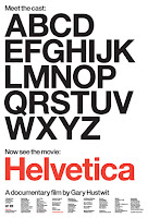
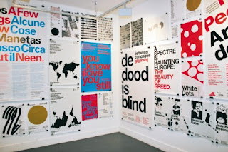
We started by looking at inspiration. I am very interested in this way of working and often find myself being influenced by many of the designers shown. We began by looking at Experimental Jetset; Experimental Jetset is a small, independent, Amsterdam-based graphic design studio, founded in 1997 by (and still consisting of) Marieke Stolk, Erwin Brinkers and Danny van den Dungen. Focusing on printed matter and site-specific installations, and describing their methodology as “turning language into objects”, Experimental Jetset have worked on projects for a wide variety of institutes. When using typography and sourcing inspiration for fresh ways of designing, I often turn to these designers for inspiration as their work is always pushing boundaries and testing the limits to how far publication can go. The resemblance is reinforced by their use of Helvetica, implemented on nearly every one of their projects, as well as their often monochromatic colour palette. This way of designing is very close to my own preference so noting them as one of the leading inspiration for this workshop is very important.

We also looked at the design work of Anthony Burrill and how his typographic and very simplistic work speaks volumes about message and intent. Anthony Burrill is best known for his written, text-based compositions, including the now-famous Work Hard and Be Nice to People. Words and language are an essential part of Burrill’s output, and he has developed a distinctive voice that is sought after not only by collectors of his posters and prints but also by clients including Apple, Google, and Hermés. Very simplistic, his posters, which just usually use one type of font, question the ideas of famous slogans and references that we hear daily. His work is very relevant to the concept of publishing and using insufficient resources to create these exciting and unique pieces of work.

We also were introduced to Berlin Design Company - Hort. Hort emerged from the Frankfurt Techno Scene in 1994 and moved to Berlin in 2007. Hort specialises in art direction, branding, creative consultancy, editorial design and graphic design as well as hosting lectures and workshops in the specific design fields. Their particular use of layout and typographic scheme throughout their work is fascinating; layering these types over sparse imagery with alternative layouts really push the limits when it comes to publication. I also particularly like the way in which Hort play around with the idea of concept and design - creating a basketball ad that has letters flying off the page and breaking up the compositional layout. Taking into account all these influences and ideas we were then presented with today's task.
We were given three very different typefaces our task was to create 3 posters using the very minimal materials provided. Using only scissors, glue and paper we were tasked to publish as many posters as we could, challenging the idea of tone, composition, layout, theme, and message replicating 4 quotes given at the beginning of the workshop. The quotes were:
- We’re all sensitive people.
- Our tools shape us.
- Technology is biology.
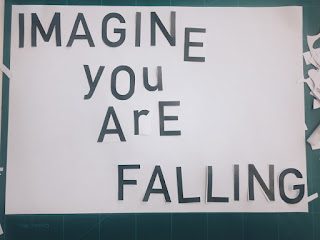
- Imagine you are falling.
Although we are restricted in resources and supplies, comparing this way of working to digital design is ironically freer; when working digitally, we are limited because of the sheer amount of freedom we have to work creatively - such as an extensive colour palette and numerous shapes and layouts we can use. Here we had to work monochromatic, and we only have the aesthetic of letters to work from.
We then had to think of the idea of creating work based on these quotes and slogans; how would we make this exciting and how would we imagine inventively than doing the obvious when producing these publication posters.
I started by looking at the quote "Our Tools Shape Us', looking at the idea of swapping between fonts and their aesthetic meanings - for example using Tools as a hard, bold, sturdy font and shaping the word "shape" by cutting letters and overlapping points. Being also inspired by glitch copying and the designs for Mikser Festival 2012 on their concept of blurring out the lines. This also related to the meaning and concept behind how our tools shape us - looking at the photocopier as a tool that I can use to reshape the aesthetic of the pieces and how I am virtually a tool in the shaping and moulding of this new look and feature. Although we were only allowed limited materials in the session, I chose to do this in my own time to add more meaning and concept behind the work I had created.

I then chose to look at the quote "Imagine you are falling". After looking around the room, the quote was being used in the same way with the same context - looking at the idea of 'falling' and manipulating the letters in a way by which the text looks like it is falling off the page. Taking this idea, I decided to go against the approach and work more in the style of Anthony Burrill and just lay the words on the page, very simple, in a way by which the reader can read these and take in the idea of actually falling. It is in this way that Burril's work makes such an influence on the reader.
I then went back to the tools quote and tried to create a more abstract approach to the design. Using the letters found in the quote, and folding the page into a shaped square, I chose to cut the letters out to form a box on the page. This idea of using the only tools to shape this more abstract aesthetic was interesting to me.
Overall, I was very happy with this workshop and found that it worked very well within my own style of designs. I will definitely use the inspiration and design ideas within my own personal work and it will make me think more inventively when looking at publication in the future.


