Wilson's Republic Conference: Tom Foley
Tom Foley is Creative Director of international type designers, Dalton Maag.Before joining Dalton Maag, he worked with Polimekanos, Micha Weidmann Studio, Atelier Dreibholz and Atelier David Smith. Tom also occasionally teaches design and has carried out lectures and workshops at Universities including Central Saint Martins, University of West England, Limerick School of Art & Design, Dun Laoghaire Institute, University of Santa Clara, Ravensbourne and SVA New York.
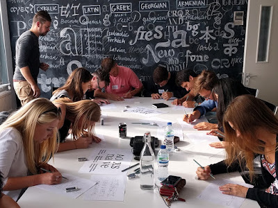
 We were introduced to the work of Dalton Maag which is based on the effect of typography, custom designed fonts that can be purchased online and the idea surrounding how a font defines a specific brand. Based around the roots idea and theme of the conference, Foley decided to talk about the roots of typography and the way in which they developed from history. He started by talking about hieroglyphics and their influence on today's typography aesthetic and how each hieroglyphic had a different meaning and background. He also spoke about abstract writing systems and their process of evolution such as Greek, Latin and Roman alphabet such as how the letter 'A' comes from an Ox Head. We also learned how the uppercase and lowercase letterforms developed; for example, the uppercase letter form developed from writing simple lines and shapes on the stone using carving methods and the lowercase evolved from the uppercase is a more simplified version.
We then also looked at the different types of pens and how these have influenced many typefaces. We compared outcomes around the broad-nib pen and then the pointed nib pen by which both creates different finishes and looks. We then looked at the Chinese based systems and how their typography is based on square metrics. Last year, I based a project on Chinese Typography, and I found this very interesting and very fascinating so learning more about this was interesting to me. There seems to be a heightened trend at the minute surrounding Japanese and Chinese Typography, especially within fashion, so learning more about this is very important to me.
We then looked at hand-writing and how it is becoming more of a trend in today's branding market. We looked at how Dalton Maag designed a new branding identity for cosmetic brand LUSH by which they based it all around this hand-written old-school vintage aesthetic. To ensure that the typeface captured the essence of the Lush brand, Dalton Maag’s designers worked closely with the design team at LUSH. During a collaborative workshop, different styles of handwriting were explored and then digitised, to arrive at a design that carried the right spirit and energy. Using a simple black and white lettering, they used the handwriting of one of the LUSH employees, developing and adapting this bespoke type that can be implemented into all the branding opportunities. Also playing around with uppercase and lowercase lettering, and exploring headline and standard text, they developed this iconic and now world known font that merely is and effortlessly now LUSH's excellent brand identity. We also learned about computer techniques that can mathematically match up which letters should touch and which shouldn't come by which would allow the company to type out a word and still let it have the natural flow of the handwriting style. This ingenious and sophisticated way of implementing human influence into the work relates back to the idea of the whole project to start with.
Overall, I was very pleased with this talk and found it one of the most interesting of the day.


